
Web-Refresh
Bringing your website into today — without a rebuild.
The website has aged — the whole thing looks like the day before yesterday. You are losing customers, and applicants above all, without noticing. But there is no time, nobody to do it, no spare capacity — and certainly no appetite for starting the whole thing again.
That is where I come in: not a rebuild, a refresh — with the logic and the tools for a website that takes work off your hands and makes you attractive to customers and applicants alike.
As a photographer and filmmaker I already know how you look: the pictures, the films, the visual language — and the words. That is the eye I now bring to the website itself.
ASK FOR A WEBSITE CHECKThe logic of back then is still in there
Around the turn of the millennium Swiss companies got their first websites. They were built by whoever could, and for the time it was pioneering work. The webmaster decided the content, the technology made the rules: little text, small pictures, everything squeezed down a narrow line.
Best kept to pure information — usability from the stone age, wrapped in a non-aesthetic with the entertainment value of a potato.
That webmaster logic is still inside a lot of websites today: this is our company, this is what we do, and anyone who wants something should get in touch. A shop window. A website can be a great deal more than that.
What a website can be today
A refresh does not rebuild the site. It teaches it today’s logic and design — and shows what a website can be besides a shop window.
- A tool that calculates. Price calculator, configurator, quantity estimate — the visitor gets a figure without picking up the phone.
- A switchboard for enquiries. Quotation, application, complaint, press — each goes straight to the right person instead of being sorted by hand.
- An archive of evidence. Projects with pictures and figures instead of a list of references. What your team did is something you see, not only read.
- An employer presence. The place where it is decided whether somebody presses the apply button. How far the application goes is up to you.
- A filing place that also works inwards. Data sheets, instructions, forms — for customers, fitters and suppliers. A website does not only have to work outwards.
- A proof of standing. With tenders, banks and public bodies, somebody looks at the website afterwards. What they see counts.
- An answering machine. AI assistants are replacing the Google search more and more. They only find answers about you if your text is stored in a form machines can read.
- An application hub. Your website takes the application — photos and documents uploaded straight to you.
What does that look like? You are on it
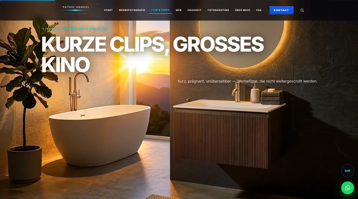
Film and scroll cinema. A price calculator that gives a figure at once. An enquiry menu that puts the request straight into the right inbox. Search across the whole site. A WhatsApp button and direct dial — one tap, no hunting. Preview images on hover, page changes with no loading pause. A microphone in every message field — speak instead of type. Galleries with a full-size view. Translated into English. An app version. I change prices and notices myself, without a content management system. Visitor counting on my own server — no third-party service, no cookies, no stored IP address. Not only findable for search engines, but readable for the AI assistants that are taking over more and more of the searching. And a few things that are not listed here.
All of it built, none of it claimed.
Built for my own needs — with a few up-to-the-minute features for the fun of it. Your website will look different.

And it is an app as well
Put this page on your phone — or on a laptop and desktop. It then starts like an app, without the detour through the browser, and it works without reception too. No app store, no separate development for iPhone and Android.
You are testing it on a real example right now — this is not a demonstration, it is the site itself. Yours can do the same.
A presence of today
It used to be enough to advertise the product and the service. Open positions cost money. To attract new people, a company has to market itself. That is cheap compared with the loss from work that does not get done.
Work that did not get done in that time.
Every month filled earlier: CHF 8’100.
The CHF 8’100 is the median salary plus employer contributions — you can adjust the value above. On top of that come HR, job ads and everything else. Those figures you know better than I do.
🔒 The calculation stays with you. Nothing stored, nothing sent.
This slider makes it plain. A fraction of that number turns your website into the outstanding application you can send to the people you want to hire.
Your website is your company’s application to the people you want to hire. I will not fill your position. But the first impression of your company — that is my craft.
ASK FOR A WEBSITE CHECK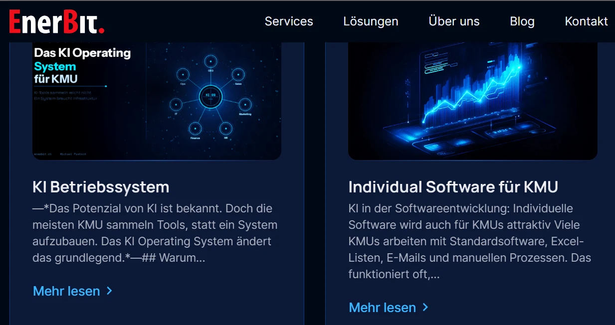
When it goes beyond the website
I build your website myself — design, content and technology. Where it goes further, I have a strategic partnership with Michael Paetsch: connections to existing systems, interfaces, automating workflows. He is an engineer and systems optimiser with thirty years of experience and solves what gets complicated. I am happy to introduce you — he has solutions for your business too.
enerbit.ch ›And I know what the other side looks like: for twelve years I designed and maintained my own website myself. It was good — for its time.
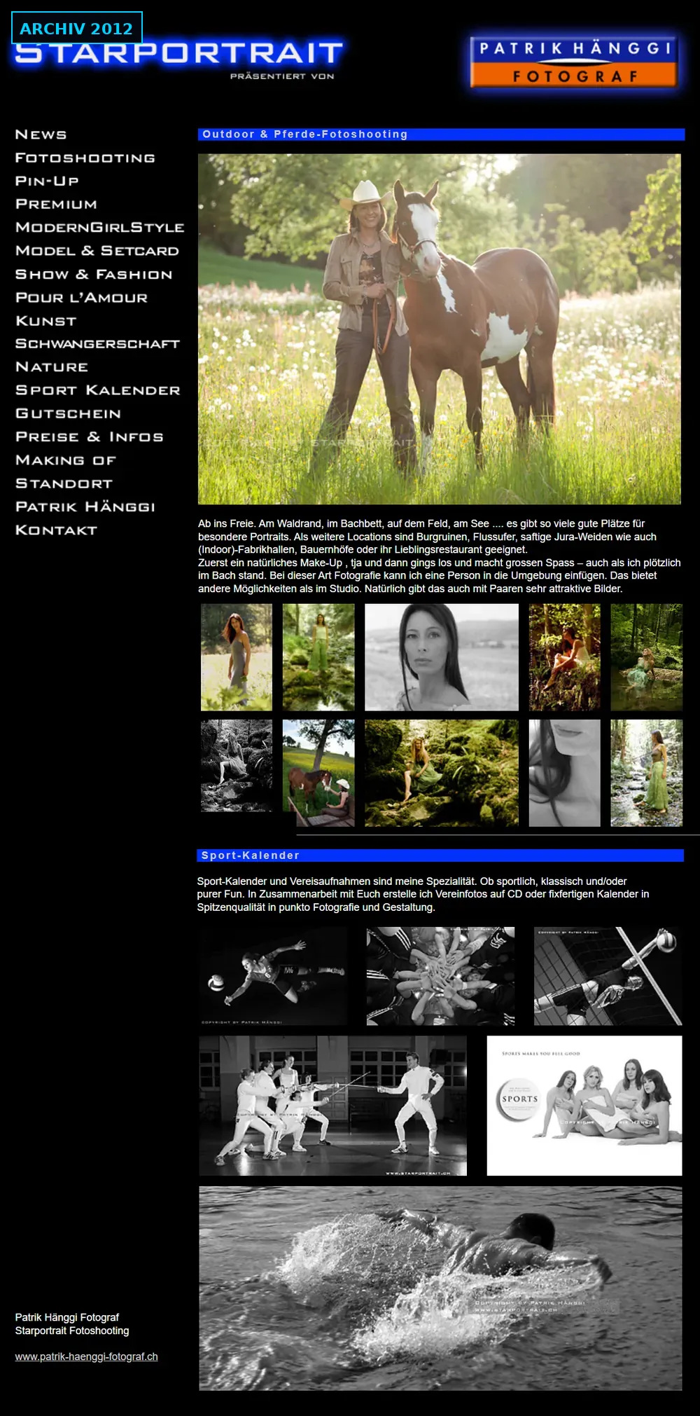 ▾ Tap the image: whole page
How it runs, briefly
What a refresh is
How it runs
What I do not promise
A single item is enough
Your pictures, your photographer
Let us look at your site
No obligation, seen with a photographer’s and filmmaker’s eye. Afterwards you know what is possible — and what it takes.
ASK FOR A WEBSITE CHECK